
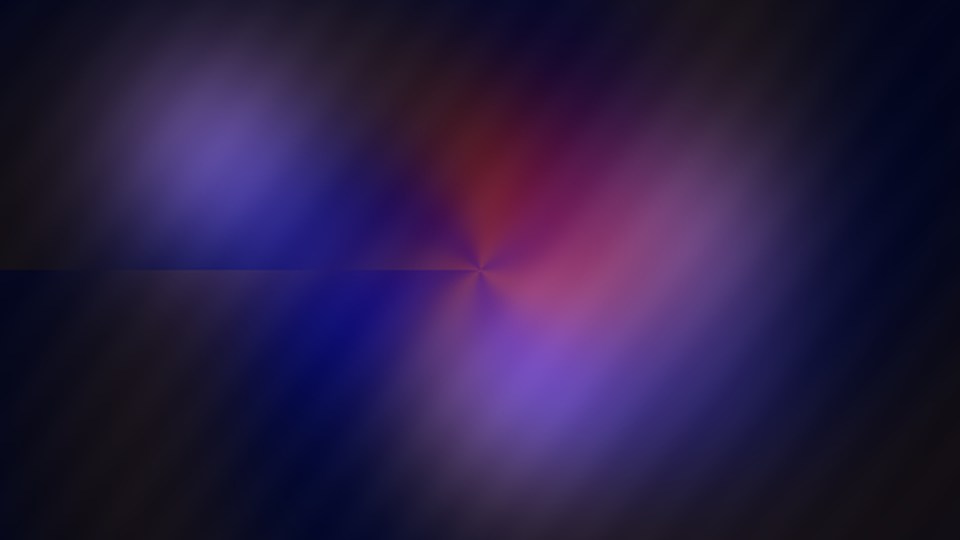
 STILL FROM CHROMATIC DRIFT · ORIGINAL ARTWORK
Make contrast do the organizing
In a crowded frame, viewers need a clear path for their attention. Brightness contrast usually establishes that path before subtle changes in hue. A softly colored shape may look beautiful, but without enough separation from its surroundings it can vanish, especially on smaller displays.
Start by viewing the scene in grayscale. If you can still identify the subject and the supporting shapes, the basic hierarchy is probably working. Color can then add personality instead of carrying the entire structure.
Let overlapping colors tell the story
A gradient does not need to be a flat background. When broad fields of light overlap, the viewer can perceive a sense of changing depth or movement even if the actual motion is slow. This is the central idea in Chromatic Drift.
Keep the number of strong colors limited. Too many equally saturated regions compete for attention, while a restrained palette leaves room for highlights and transitions to feel significant.
Watch for the edges
The meeting point between two colors can be more visually interesting than either color alone. Soft edges suggest haze and distance. Hard edges suggest sharp, graphic forms. Neither is automatically better; choose based on the effect you want.
On a compressed video, extremely subtle gradients may show banding. Gentle texture, intentional contrast, and sensible export settings can reduce how obvious those steps appear.
Design for different screens
Phones vary widely in brightness, color reproduction, and screen size. Test whether small details and low-contrast areas still read on a normal mobile display. Do not rely on a specific wide-gamut display for the central message of a visual piece.
Use ordinary sRGB-friendly assets for wide compatibility unless you have a controlled reason to do otherwise. Always check that buttons, captions, and important text remain readable independent of the video artwork.
See the idea in motion.
Watch the related original study and notice how the principles described above come together in a short, silent animation.
Watch Chromatic Drift ↗